
Sam Hallas' Website
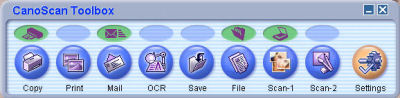
Most modern scanners come with a simple user interface to control scanning functions. In general it does a pretty good job for a selection of common tasks - photographs, clean documents etc. When it comes to more tricky tasks, such as faded documents or print on coloured paper, it can struggle to produce a good result. Here's the control panel for my Canon scanner.
Behind the easy-drive user interface, scanners usually have a TWAIN interface which give you more hands-on control of its functions. This is usually the interface that opens when you access the scanner from photo editor programs like Photoshop® or Paintshop Pro®.
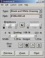
The venerable HP DeskScan shown left doesn't have a pretty interface just this control panel. The Canon comes up with the more detailed menu on the right once you click one of the buttons. The names of the scan modes vary. For black & white mode it may be called that or 'line art', 'line drawing' or similar. Greyscale may also be called black & white photo. Colour may be called 'millions of colours', 16 million colours', or, more confusingly, '8 bits/channel'.
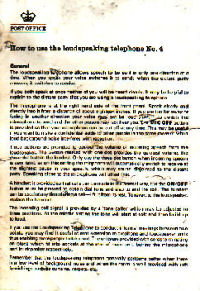
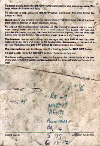
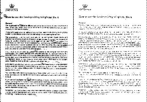
The two problems which give me difficulty with scanning old documents in black & white are poor print density and non-white background - coloured, faded or discoloured paper. Look at the User Instructions for the Loudspeaking Telephone No 4 below. The A5 card is folded and torn and the back looks as if it's been dropped in a puddle and stamped on as well as scrawled over in ball-pen with numbers.
I can usually overcome these problems by adjusting the black/ white threshold of the scanner. (It's labelled 'brightness' on the HP panel above left). On some scanners this control must be accessed under 'Advanced' controls. I'll try to explain what's going on.
As the scanner scans a document it measures the brightness of each pixel on a scale from 0, black, to 255, white. If it is greater than the brightness setting it will be set to white in the final image and if it's below it will be set to black. I usually make the scanner do a preview scan first and then tweak the threshold until the background is uniformly white. I don't place much faith in the preview image as it's pretty low resolution, but gives a rough guide. The final image, viewed in a picture editor or even Microsoft® Word is a better judge of quality. Here are two sample of text with the threshold too low (left) and too high (right).


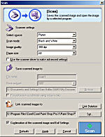
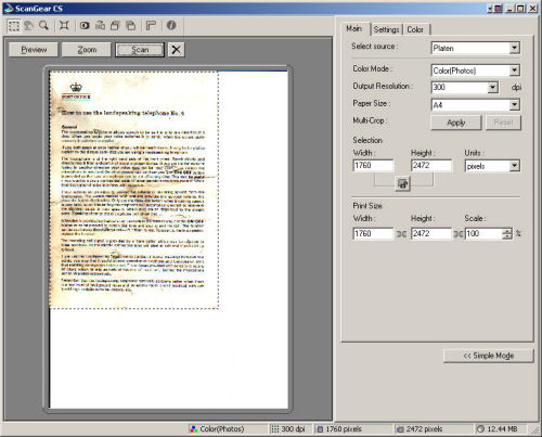
I'll go through the steps I took to restore the grotty User Instructions above to some sort of decent state. First I opened the scanner control panel from within my image editor and performed a preview scan to set the page size.
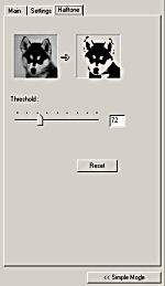
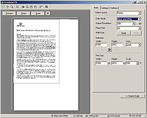
Next I changed the colour mode (second box down) to "Black and White". Notice that the "Color" tab at the top has now changed to "Halftone". The preview has changed to black and white.
It doesn't look too bad - a few smudgy bits in the white area - but I checked by clicking on the Halftone tab to try different settings.
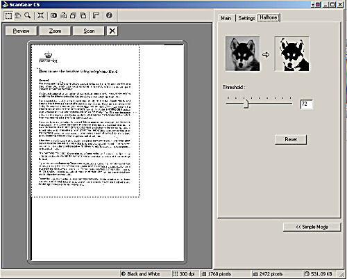
You can see that the default threshold is 72, which is usually a pretty good compromise. I tried winding it up to 110 and down to 40 with the results below.
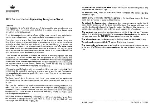
I judged that it needed to be slightly lighter than the default, but you can see that 110 is too dark and 40 is too light. I settled on 60 as a best guess and did a final scan. It looked good and so I scanned the other side which I think you must agree is dramatically improved.

A few tweaks with the image editor to remove the handwritten scrawl and some smudgy bits and I had the results below.
I converted it to an Adobe Acrobat® file and you can see the results here. The file size is 72 kB. However, the numerous tears in the original mean that parts of the text are skew and not very readable. To find out how I cured that and made the file even smaller have a look at....
or move on to....
Document Repository